
Guiding
Reese Consumer Health
Through a Pinworm Packaging Redesign
Objectives
Reese Consumer Health set out to update the packaging for its pinworm treatment product. To support this redesign, they needed clear, consumer‑driven guidance on overall appeal, preference, and likes/dislikes.
Methodology
- We conducted 900 online interviews in June 2025 among adults 18+. This broad sample allowed us to understand both category familiarity and incidence of pinworms.
- Respondents were assigned to one of three test cells. Each cell evaluated the current package plus one of the three new designs. This allowed for controlled, comparative evaluation across all designs.
- A heatmapping exercise captured what package elements consumers like and dislike—colors, claims, icons, layout, etc.
Key Findings
Test Package 3 had a slight edge over the other new package designs. Consumers responded positively to several elements:
- Clear communication of what the product treats
- Easy‑to‑read information
- A professional, trustworthy look
- Strong resonance with the #1 doctor-recommended claim
- A preferred color palette
Impact
The research findings guided Reese Consumer Health toward a refined, consumer‑validated package redesign. The new design, matching the design and colors from Test Package 3, features simplified front‑of‑package claims reflecting consumer preferences.
Outcome
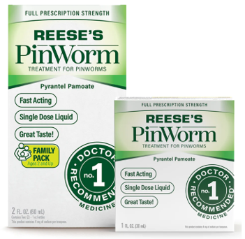
In February 2026, Reese Consumer Health introduced the redesigned package. The new package design strengthened clarity and visual appeal and better aligns with what consumers would look for in a pinworm treatment. Research insights played a pivotal role in deciding which package design and claims to move forward with.