
Visualizing Importance and Performance to Create
a Clear Picture and Story
It is not enough to know how a brand performs — there is also a need to understand what matters most to potential customers. That’s where performance importance charts come in. They are a simple, but powerful way to visualize what’s working and where improvement will make the biggest impact.
With these charts, importance, or how much potential customers care, is plotted on the X-axis. Performance, or how well a brand delivers, is plotted on the Y-axis. The two measures form four quadrants that tell a clear story.
- Leverage – important items with high performance, or in other words, strengths.
- Improve – important items that have low performance, thus may need improvement.
- Monitor – items that aren’t performing well but are less important, so should monitor for any changes in importance.
- Status Quo – less important items that are performing well, so giving them attention would be overkill.
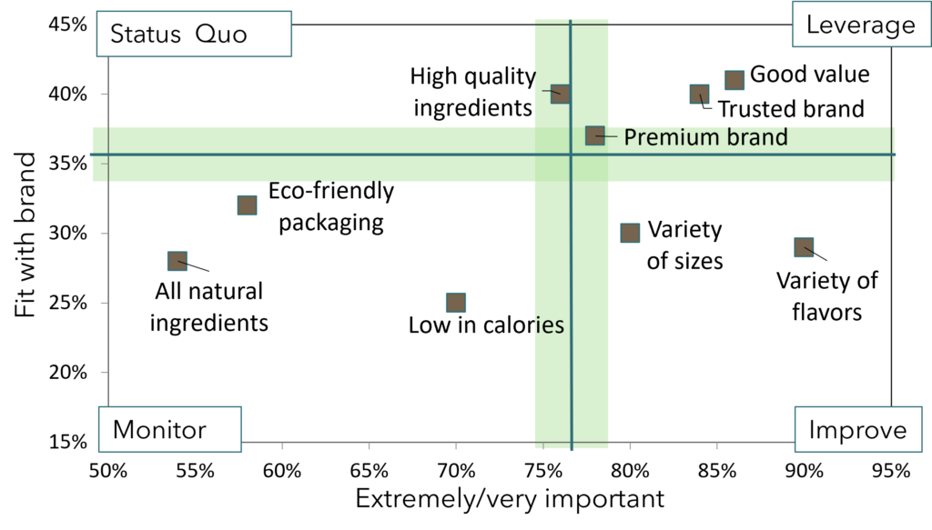
Instead of just guessing what is working and what to fix, the chart shows where improvement will actually drive impact. In the example chart, the brand is seen as a good value, trusted, and premium. The brand needs to increase the variety of options in both flavors and sizes.
Performance improvement charts are more than just data points; they help brands make smarter decisions. To see how a performance improvement chart could help your brand focus and grow, please reach out!